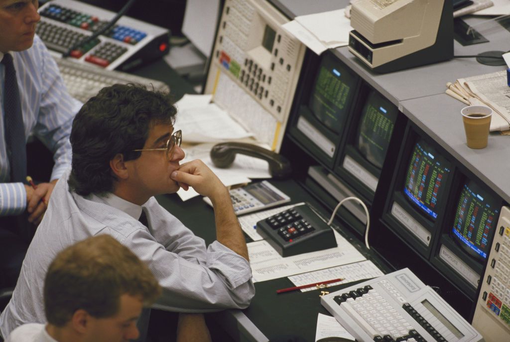
TikTok is full of chartists performing technical analysis. Investment banks used to employ them. Robert Edwards's and John Magee's Technical Analysis of Stock Trends, a book first released in 1948, is still going strong with its eleventh edition. It is considered by some to be the Bible of the discipline, yet today, an aspiring graduate interview candidate would be advised not to mention having read it.
Institutional certification numbers tell a similar story. The Chartered Market Technician Association, a body dedicated to the art of chart reading, counts about 2,500 active charterholders. Meanwhile, the CFA Institute is a global organisation setting standards for investment professionals; it runs the Chartered Financial Analyst (CFA) programme.
The group's syllabus has become the industry standard and it has 200,000 charterholders. It dropped technical analysis as a standalone chapter, although not for lack of space; the famously extensive curriculum spans thousands of pages.
Start your trial of MoneyWeek today
Get unparalleled financial insight, analysis and expert opinion you can profit from.
Start your trial
Sign up for MoneyWeek’s free twice-daily newsletter.
Join more than 165,000 subscribers and keep yourself informed with latest financial news, insights and expert analysis to help you understand what really matters when it comes to your finances.
Join more than 165,000 subscribers and keep yourself informed with latest financial news, insights and expert analysis to help you understand what really matters when it comes to your finances.
Nevertheless, millions of individuals, amateurs and professionals alike, continue to rely on charts. Here we ask what led the finance industry to fall out of love with them and whether old-school technical analysis still has anything to offer.
Why technical analysis fell out of favour
Technical analysis in its purest form means making buy and sell decisions based on the trading behaviour of others. The guiding premise is that the market for anything is like a shoal of fish. Price ticks and volume bars are clues around the edges that, when used wisely, can give valuable insights into the probable direction of the next move.
The received wisdom on why the practice gradually lost relevance is that computers took over. Nobody had to look at charts any longer because flicking through screens and printouts had become obsolete. Desktop computers proliferated. The Python programming language appeared in 1991 and began to make data science widely accessible.
Charts are limited to two, or possibly three, dimensions of data. Statistical techniques were able to cope with as many as the available computing power supported. People now had a choice when it came to seeking alpha (a return on investment on top of the performance of a benchmark index); they could hire a chartist to hand-draw lines, or they could have a “codesmith” mix and match a bewildering number of factors in near-infinite combinations across thousands of instruments through innumerable time periods.
The first serious limitation of this theory is oversimplification. Horses and the car coexisted for decades until World War I reshaped logistics. E-mails and self-service have similarly not done away with legions of white-collar relationship managers. Why only the chartists?
Second, it is of limited value. Not every investor has access to data pipelines, computer models and a team of statisticians. If technical analysis is better than a placebo, many people would still have a use for that information because in getting from A to B, someone else's Ferrari does not make it pointless to own a Ford Fiesta.
History supports this principle. Jesse Livermore, the thinly veiled subject of Edwin Lefevre's best-selling fiction Reminiscences of a Stock Operator made (and lost) his fortune several times over between the 1890s and the 1920s. His final winning streak came during the Wall Street Crash of 1929, when, as millions lost their shirts, he made enormous profits from correctly calling the top.
So envious were some that Livermore became a hate figure with a need for bodyguards. More importantly, he was often able to trade successfully using little more than ticker tape – the same price and volume information that forms the bedrock of contemporary technical analysis.
Academics versus the chart
Wisconsin is the world's single-largest source of cranberries. Illinois is home to 85% of American canned-pumpkin production. It was decades after Livermore's time, from these agricultural heartlands of the American Midwest, that peer-reviewed validation of chart-based trading strategies would arrive. In 1992, William Brock, Josef Lakonishok, and Blake LeBaron published a paper with a troubling conclusion for the efficient-market hypothesis.
The price history of the Dow Jones index from 1897 to 1986 provided surprising support for some very simple technical-analysis strategies based on moving averages and trading-range breakouts. Predictive chart reading was supposed to be one notch above newspaper horoscopes. Their analysis of just under a century's worth of data begged to differ.
A year later, a separate and now landmark study by Narasimhan Jegadeesh and Sheridan Titman of UCLA determined that momentum also matters. Financial disclaimers were wrong. The idea spread and the citations piled up. Past performance was a direct predictor of future returns, or so it seemed.
The main reason the argument was never fully settled to everyone's satisfaction was data dredging. Try enough infinitely configurable combinations of useless moving averages, trend patterns, Bollinger bands, or breakout windows, and something will eventually back-test to perfection.
Academics grappled with this issue until, in September 2000, the economist Halbert White invented a measure of data-mining bias which he called the Reality Check method. The drawback was that it relied on an accurate record of all the failed attempts to find a profitable strategy.
It went against self-interest to do this, however, because each dead end documented would make any final breakthroughs seem less profound, and therein lay the problem. Computing had become cheap and the maths was solid. The incentives for honesty remained unchanged.
More fundamentally, it was quickly becoming apparent that if so many different studies were possible, then there was clearly no unified concept of “technical analysis” to begin with. How long was a moving average, a holding period, or a piece of string? Some technical indicators are in fact subjective to the point that even committed proponents lovingly mock their likeness to psychiatric Rorschach ink-blot tests. The classic head-and-shoulders pattern is a case in point.
It appears everywhere and nowhere; sometimes the right way up, other times upside down. The researchers of the 1990s were using rigid models to assess the inherently flexible, inconsistent and at times contradictory behaviour of chartists. It was the parable of the blind men and the elephant, only with trades.
Time horizons also remained a topic of disagreement. Where the shoal of fish might be ten seconds from now seemed more predictable than where it may end up in a year, but some proponents argued the contrary. They cited long-term trends as being far less random and more powerful than short-term volatility.
In practice, forecasters tend to play it safe by wording their prophecies loosely. Gold, for instance, formed a triple top between 2011 and early 2022. The monthly MACD indicator was in negative divergence. In chart speak, this means a sell-off was imminent. The reports were circulated. The big calls were made. They were correct over six months, pointless after a year and horrendous beyond.
After counting the votes and correcting for data-mining biases, mainstream finance did reach a tentative consensus. With the requisite ifs and buts, technical analysis, used well and in the short term can outperform buy-and-hold in the pockets of the market that are immature and inefficient. A simple near-term momentum capture strategy in niche small-caps might do something useful. Calling the top of the market based on Elliott Waves covering a forty-year plot of the S&P 500 is impossible to test against an apples-to-apples sample of similarly long time periods throughout history.
Enter the quants
The computational forces that enabled the analysis of large datasets in academia throughout the 1990s had another, more ostentatious effect. They triggered a golden age for hedge funds. Before its spectacular collapse became the subject of several books, Long-Term Capital Management (LTCM) commenced operations with what, in today's money, was seed funding of around $2.2 billion.
The elevator pitch was that Myron Scholes and Robert Merton were involved. These soon-to-be Nobel laureates were two out of the three names who both literally and figuratively wrote the book on the hitherto intractable challenge of how mathematically to model the value of convoluted financial derivatives. Charts were out. Parabolic partial differential equations and elaborate arbitrage trades were in. The first three years together delivered annualised returns of around 35%.
Finance did not, however, divide neatly into econometric wizardry on one side and dusty charting on the other. The prestigious likes of LTCM were risky products that remained restricted to an exclusive set of institutional and ultra-high-net-worth clients. For everyone else, the rapid spread of internet connectivity made public participation in financial markets easier than ever. Gone were large minimum account sizes and unaffordable commission rates.
Online brokerage platforms had arrived and with them mass-market access both to charts and questionable dotcom stocks alike. Now investors could make their own decisions about trading ranges and breakouts. Financial-services firms had to find new ways to demonstrate value and justify their existence, let alone their fees. Fate was on standby, about to lend them a hand.
The revenge of the analysts
First came the Asian financial crisis of 1997. It was bundled with the hallmarks of crony capitalism, specifically eye-watering leverage, absurd cross-holdings and wafer-thin bank capital reserves. Its economic fallout was a key driver of the Russian sovereign-debt crisis one year later, which in turn blew up LTCM.
There followed the dotcom crash of 2000, then catastrophic accounting scandals at Enron in 2001, WorldCom in 2002 and Parmalat in 2003. Each episode meant the unravelling of a popular blind belief, whether in the Asian Tigers, automatic post-communism prosperity, visionary CEOs, or the vast riches that would flow from anything being put online.
This short calamity-rich period highlighted the importance of both financial analysis and due diligence – something neither lines on a chart nor a catchy jingle could ever be a substitute for. Quality-oriented fund managers talked about how their portfolios had weathered the storm through resilient and well-proven business models. Value-focused ones were proud of not having bought things at any price.
There was a macabre parallel with the academic debate on data trawling; put all of finance through a series of crises and there will always, by definition, be survivors. In his 2001 bestseller Fooled by Randomness, Nassim Nicholas Taleb was at pains to point out that they may not necessarily all be geniuses.
A strange new afterlife for technical analysis
Much of what technical analysis was invented to do lives on today under different umbrellas. Testable momentum signals, for example, are integral to quantitative finance and factor investing. The more discretionary aspects of chart reading, however, were never rebranded. They are today to finance what Reddit has become to cutting-edge AI – full of nonsense, inappropriate to quote in the boardroom, but nevertheless a source of knowledge too valuable to discard. Were such charting tools truly redundant, they might long since have been retired as a feature of the expensive Bloomberg terminals that power the industry.
A glossary of key terms in technical analysis
Basic chart mechanics
Vertical bars showing how many shares or contracts were traded during a given period. Chartists use volume to gauge the market's conviction behind a price change or a specific trading level.
Over time, a financial instrument might fluctuate in price between relatively consistent upper and lower boundaries. The lower boundary is support, where increased buying tends to emerge; the upper is resistance, where additional selling tends to appear. A move beyond either boundary is called a breakout or a breakdown.
Mathematical indicators
The rolling average price of a security over a specified number of periods. This smooths short-term fluctuations, making trends easier to identify. Crossovers between moving averages of different lengths are often treated as trading signals.
A moving average with upper and lower bands, all calculated from recent prices and overlaid onto a chart. The bands widen when price volatility increases and narrow when trading is calm. This helps to identify prices that are unusually high or low relative to prevailing levels of volatility.
The tendency of prices to keep moving in their existing direction. Momentum indicators measure the strength or rate of price changes. This helps to distinguish persistent trends from those losing force.
Short for Moving Average Convergence Divergence. This indicator, typically shown in a separate but aligned panel below the price chart, consists of two fluctuating lines. The MACD line represents the difference between short- and long-term moving averages of the price. The signal line is a moving average of the MACD line itself, smoothing out its fluctuations. Crossings between the lines are read as signs of strengthening or weakening momentum.
Chart patterns and theories
When prices reach approximately the same high three times without breaking through. Traditionally, this is interpreted as a bearish reversal, especially if the price then breaks down through recent support levels.
A pattern in which price and a technical indicator move in conflicting directions. Bearish divergence occurs when prices make higher highs while a momentum indicator makes lower highs, suggesting that the upward trend may be weakening.
Head and Shoulders
A reversal pattern featuring three successive peaks, with the middle peak higher than the other two. A fall below the line joining the intervening troughs, known as the neckline, is traditionally seen as bearish. Turned upside down, the pattern is an inverse head and shoulders. A break above its neckline is deemed bullish.
A theory proposing that market prices move in recurring sequences driven by investors' collective psychology. Its classic formulation identifies five waves in the direction of the prevailing trend followed by three corrective waves. Identifying and counting them involves considerable interpretation.
This article was first published in MoneyWeek's magazine. Enjoy exclusive early access to news, opinion and analysis from our team of financial experts with a MoneyWeek subscription.